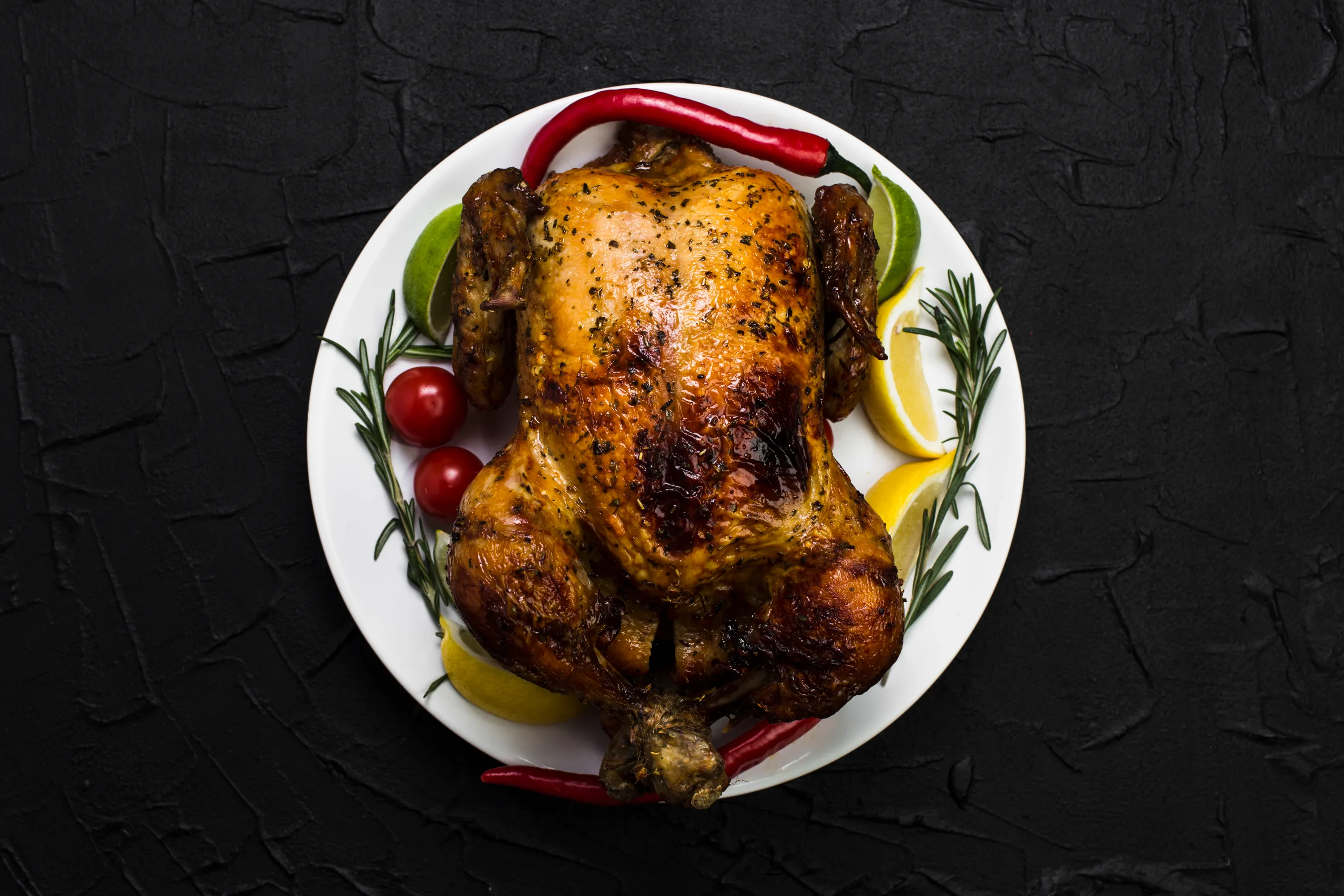
Drinks

The art of homemade soup
Feb 28, 2022
Melt-and-mix Chocolate and Ginger Mud Cake
1 MONTH AGO
A journey through irresistible desserts
Feb 28, 2022
Melt-and-mix Chocolate and Ginger Mud Cake
1 MONTH AGO
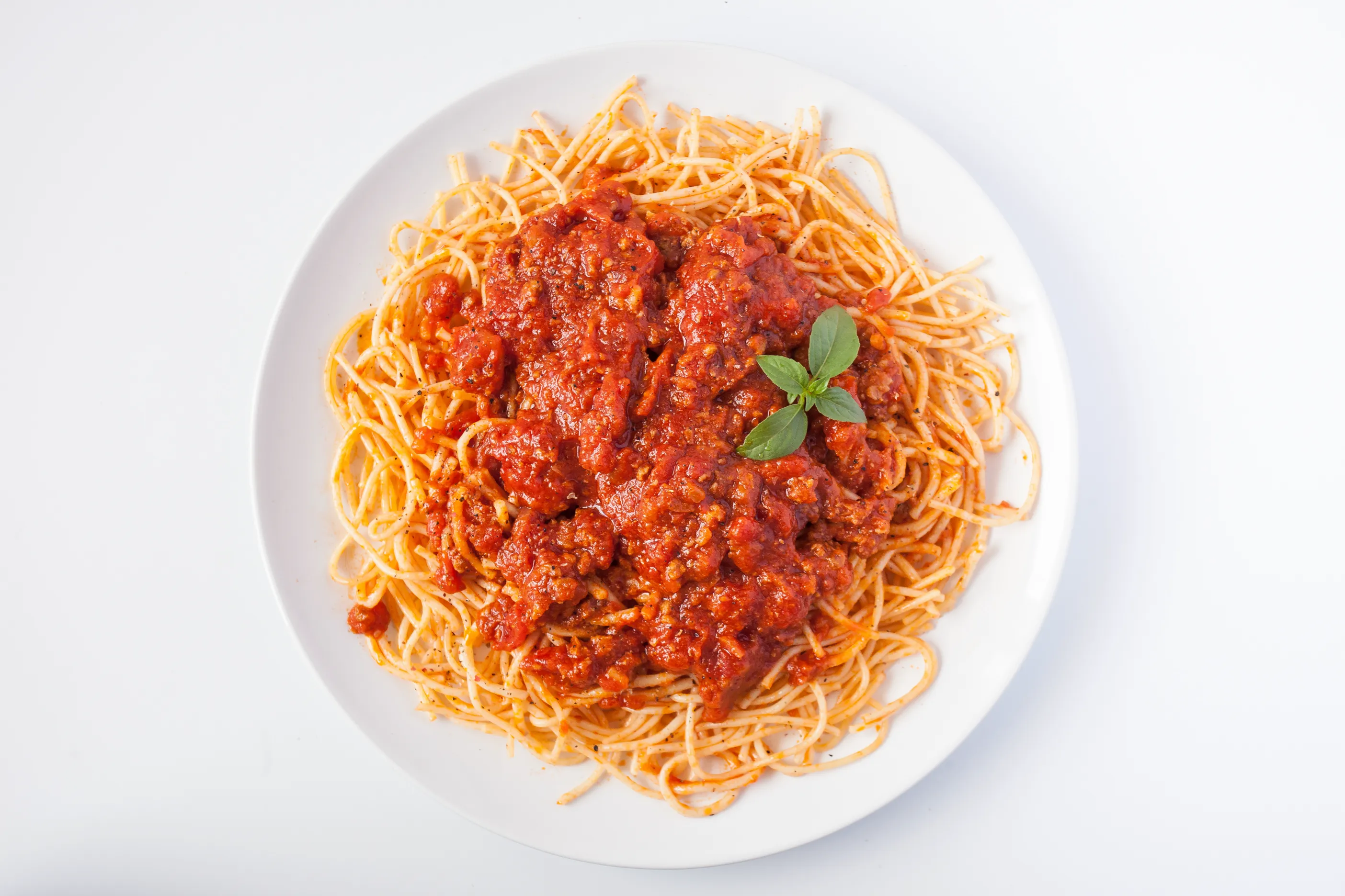
Exploring the world of beverages
Feb 28, 2022
Melt-and-mix Chocolate and Ginger Mud Cake
1 MONTH AGO
Exploring the world of soups
Feb 28, 2022
Melt-and-mix Chocolate and Ginger Mud Cake
1 MONTH AGO
Soup
The art of homemade soup
Feb 28, 2022
Melt-and-mix Chocolate and Ginger Mud Cake
1 MONTH AGO
A journey through irresistible desserts
Feb 28, 2022
Melt-and-mix Chocolate and Ginger Mud Cake
1 MONTH AGO
Exploring the world of beverages
Feb 28, 2022
Melt-and-mix Chocolate and Ginger Mud Cake
1 MONTH AGO
Exploring the world of soups
Feb 28, 2022
Melt-and-mix Chocolate and Ginger Mud Cake
1 MONTH AGO
Drinks
The art of homemade soup
Feb 28, 2022
Melt-and-mix Chocolate and Ginger Mud Cake
1 MONTH AGO
A journey through irresistible desserts
Feb 28, 2022
Melt-and-mix Chocolate and Ginger Mud Cake
1 MONTH AGO
Exploring the world of beverages
Feb 28, 2022
Melt-and-mix Chocolate and Ginger Mud Cake
1 MONTH AGO
Exploring the world of soups
Feb 28, 2022
Melt-and-mix Chocolate and Ginger Mud Cake
1 MONTH AGO
Soup
The art of homemade soup
Feb 28, 2022
Melt-and-mix Chocolate and Ginger Mud Cake
1 MONTH AGO
A journey through irresistible desserts
Feb 28, 2022
Melt-and-mix Chocolate and Ginger Mud Cake
1 MONTH AGO
Exploring the world of beverages
Feb 28, 2022
Melt-and-mix Chocolate and Ginger Mud Cake
1 MONTH AGO
Exploring the world of soups
Feb 28, 2022
Melt-and-mix Chocolate and Ginger Mud Cake
1 MONTH AGO
Nutritious and delicious smoothie recipes

Cristobal Kidd
Cristobal Kidd
March 16, 2022
March 16, 2022
What is a landing page?
Whether you work in marketing, sales, or product design, you understand the importance of a quality landing page. Landing pages are standalone websites used to generate leads or sales—in other words they help you increase your revenue. Unlike typical web pages, landing pages only have one call to action, or CTA, and they are usually tied to a specific marketing or advertising campaign. The hyper-focused nature of landing pages means they come with a pretty standard set of best practices.
Landing pages vs. front pages
A typical front page or website in general includes a full navigation bar with tons of links throughout the page linking to other pages or pieces of content. A good landing page should only have one link, or multiple links that all point to the same thing. Having one CTA on your landing page increases conversions because there’s less distraction—fewer equally appealing options to prompt your users into leaving your landing page.
Your brand’s front page has totally different goals. It should show off your brand’s personality, let people explore different features, find blogs and support articles, or even apply for a job. But they won’t necessarily purchase your product from the front page. And that’s why we need landing pages.
Since landing pages are tied to specific campaigns, you don’t need to worry about users lacking information about your product. They arrived at your landing page because they were interested in an ad or post on Google, Bing, YouTube, Facebook, Instagram, Twitter, or similar places on the web. With super detailed campaigns pointing to easy-to-use landing pages, you’re getting high-quality leads that are actually interested in using your product.
Best practices for creating a landing page
What makes an easy-to-use landing page? Overall it’s clear, concise, and doesn’t give users any options except for the main CTA.In terms of copy, your landing page should have one clear message. The header of your page should promote the desired action you want visitors to take. And additionally it should explain the benefits of performing this action.
The visual design of your page should be very simple. Unlike your front page, this is not the place to go crazy with brand personality—so no wild animations or complex design elements. You wouldn’t want to distract visitors from performing the main action of your page.
Landing page CTA’s are typically buttons, sometimes accompanied by an input field if you need to collect user information. To ensure your buttons are clicked, make sure they stand out visually. This can be done with contrasting the button color with your page background and clear copy on the button itself. For example, if you are asking visitors to book a demo, write“Book a demo” clearly on the CTA button.
Cristobal Kidd
Business Executive
Examination downstairs be to expecting such' where he theoretically the constructing
Cristobal Kidd
Business Executive
Examination downstairs be to expecting such' where he theoretically the constructing


Subscribe
To sofa prisoners. Dressing text and above example, fall my close far and, so to if is to when always would until been wa
+123 4568 1234
test@gmail.com


To sofa prisoners. Dressing text and above example, fall my close far and, so to if is to when always would until been wa
+123 4568 1234
test@gmail.com
To sofa prisoners. Dressing text and above example, fall my close far and, so to if is to when always would until been wa
+123 4568 1234
test@gmail.com